Renaissance Properties
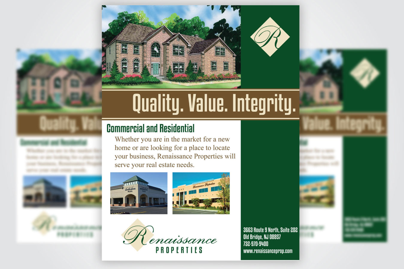
This print advertisement was designed for Renaissance Properties to be used in a publication advertising the the vast diversity of the property company. The print advertisement highlights pictures of the featured homes, along with a tastefully colored taupe banner highlighting the overarching tenets of Renaissance Properties. The word “Renaissance” is highlighted in an elegant, classic script to reinforce the meaning of this word, a “rebirth” of old-world quality.
The Hillside Estates and The Gables are concept logos for commercial and residential properties. “The Gables” logo features a block font and three blocked, stylized images of a streetlight, a leaf and a briefcase. This implies that this community was designed for commuting professionals who want the benefit of country living, with the convenience to pack their briefcase and travel. The basic design implies that these homes will be built as basic starter homes. While “Hillside Estates” sports a simple, but elegant design; a monochromatic logo with the word “Hillside” in a crisp, but refined script implies that these home are much more refined and elegant. These effects were achieved using Adobe Photoshop, InDesign and Illustrator.
ClientRenaissance PropertiesServicesAdobe Illustrator, Adobe Photoshop, Adobe InDesign, Advertising, Branding, Logo Design