Wigwam Skate and Event Center
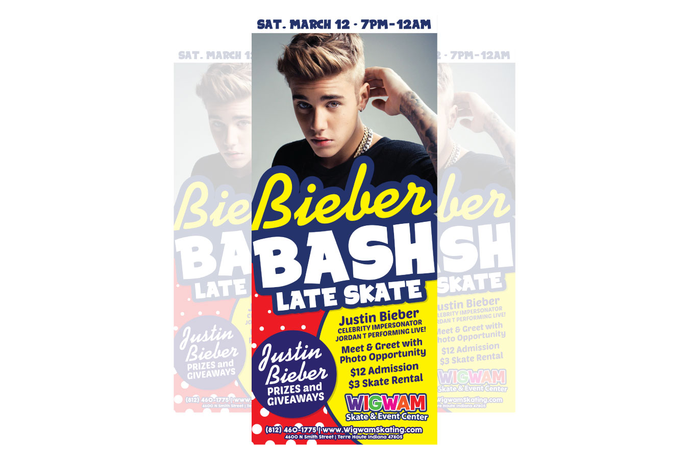
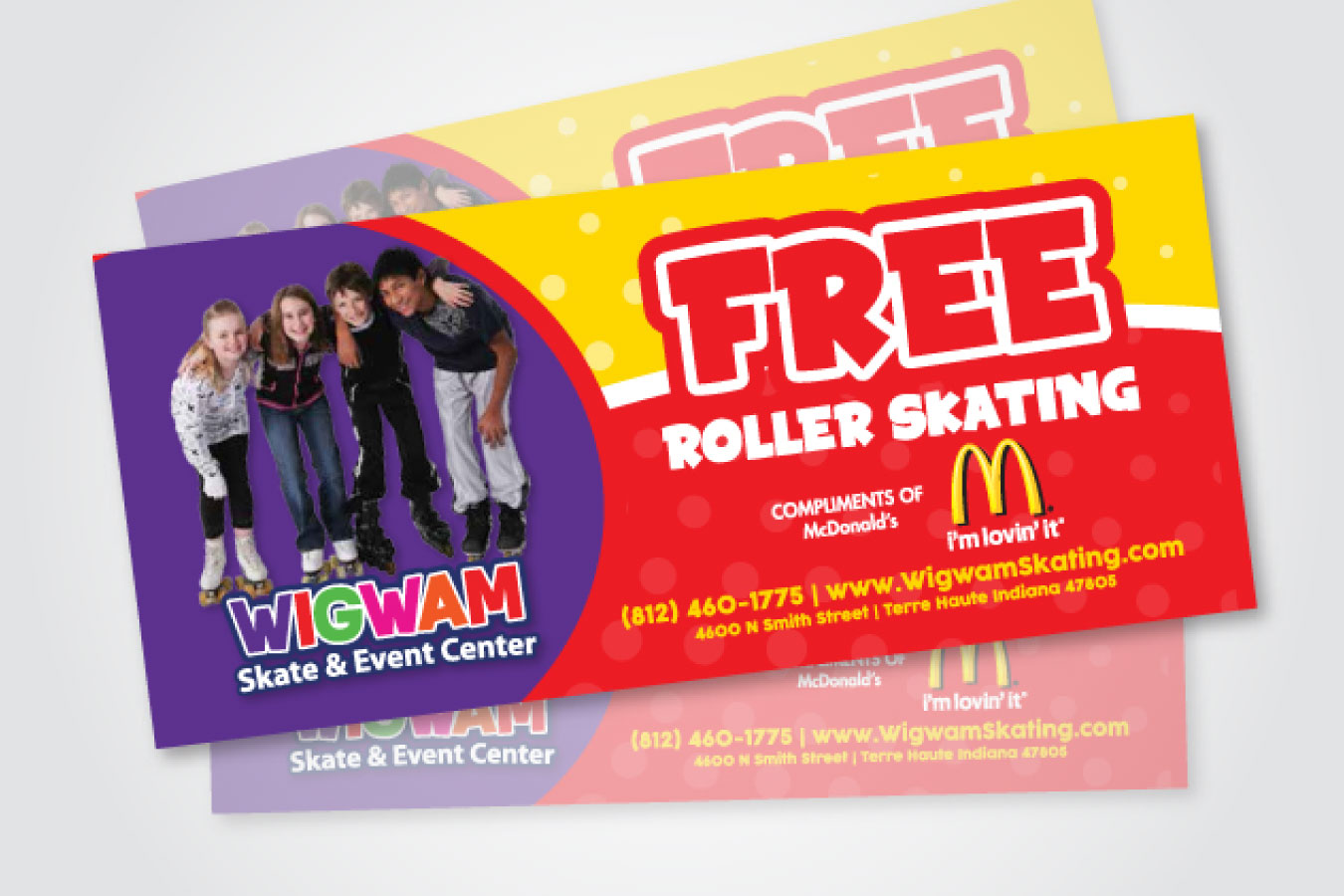
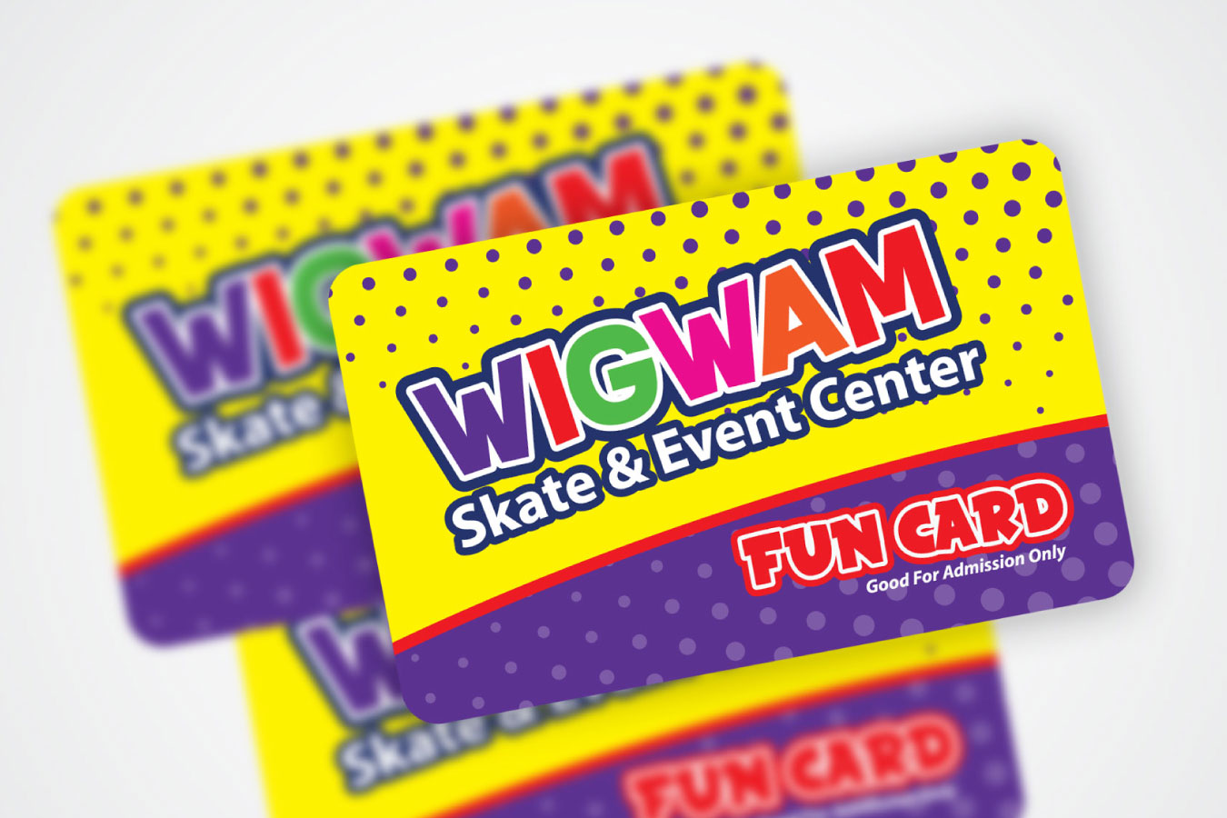
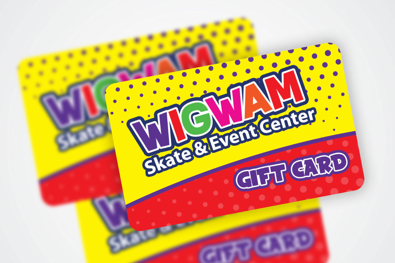
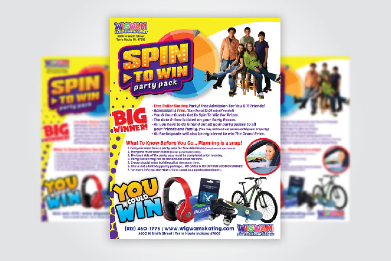
Wigwam Skate and Event Center was looking for a brand and a logo, so we did a little something different and exciting for this venue. We played on the similarities between the words “skate” and “Skittle.” This resulted in a logo that has the look and feel of your favorite childhood candy logo. In line with the multicolored candy logo, we used a rainbow of colors for each of the letters in “Wigwam” along with fun gradient dots speckling the background on the gift cards, fun cards and event advertisements. It almost makes you want to tear open the package for a sweet treat! But that treat is better than candy, it’s an event-filled day of skating and events. This fun and engaging color and font scheme it carried through the logo, cards and advertisements. These eye-popping effects were achieved using Adobe Photoshop, InDesign and Illustrator.
ClientWigwam Skate and Event CenterServicesAdobe Illustrator, Adobe Photoshop, Adobe InDesign, Advertising, Branding, Logo Design